Composed
We do not rush the room. Urgency is designed; panic is not a process.
The Brand Book · Volume 01
Kigali · A marketing studio
Presence, made inevitable.
Established 2018
Kigali · By appointment
01 — The House
Core is not a department and not a campaign. It is the structure a brand stands on when the noise is stripped away.
We partner with a small number of companies who already know they are not average — and who want their public presence to finally match that fact.
Digital marketing, social, promotion, and content are usually bought as separate trades. That is how brands become loud in one place and absent in another. Core holds them as one architecture: the argument, the channels, the evidence, and the amplification. Structure first. Then signal. Then scale.
We are a house, not a mill. Senior rooms. Retained partnerships. A standard that does not drop when the calendar gets full. Based in Kigali. Working wherever the work is serious.
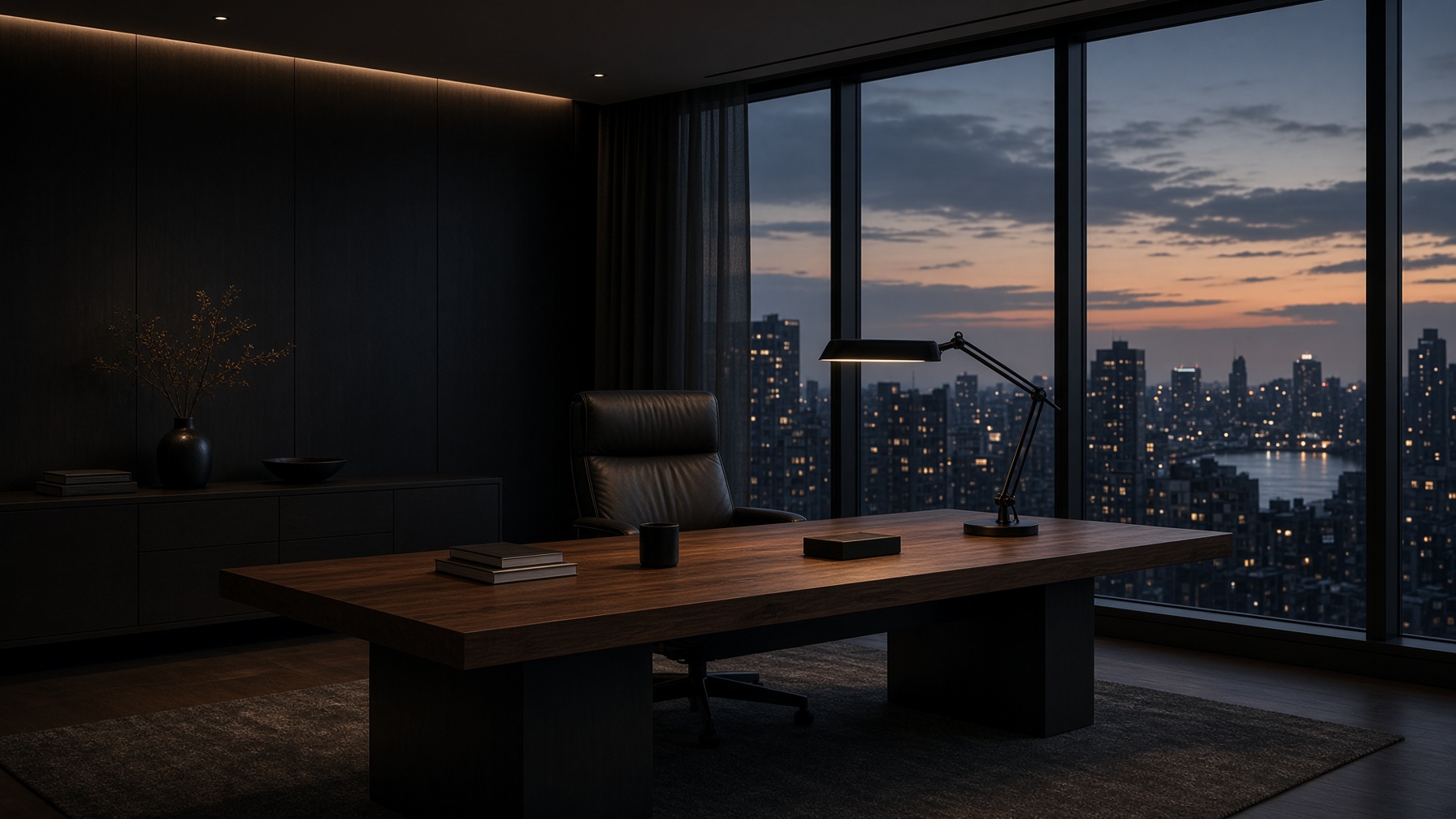
Composed
We do not rush the room. Urgency is designed; panic is not a process.
Exact
Words, crops, and timings are considered. Approximation is expensive.
Discerning
We take fewer partners so the work can go further. Fit is a discipline.
Warm at close range
The public face is restrained. The working relationship is human, direct, and loyal.
02 — Position
High-ticket work requires a high-ticket standard. We do not rent attention. We build it.
For
Founders, houses, and professional practices that already sell at a premium.
Does
Architects digital presence — strategy through promotion — as a single system.
Unlike
Volume agencies, freelance scatter, and work that looks busy without becoming inevitable.
Practices
I
The argument
Positioning, narrative, and the decisions that make every other decision cheaper. We write the brief we would want to receive.
II
The channels
Social architecture, platform roles, and a cadence a brand can actually keep. Not more posts. The right ones, on purpose.
III
The evidence
Film, stills, and language directed as one system. If it would not survive a quiet room, it does not ship.
IV
The amplification
Paid, launched, and always-on growth built on the strategy — never instead of it. Attention, rented only after it has been earned.
Engagements begin by conversation. We take the work that can be done properly, and we decline the rest.
03 — The Mark
The mark sits to the left of the name. CORE is the larger line — semibold, tracked. MARKETING sits beneath it, smaller, regular, in limestone.
Primary mark — on ink. Ivory outer, stone inner, juniper nucleus. Use this digitally, in film, and on dark print.
Construction. Clear space equals one core-diameter on every side. Minimum size: 20px digital, 8mm print. The nucleus is always Juniper, except in single-colour reproduction.
Horizontal
Stacked
Wordmark
Fields
On Ink
On Vellum
On Night
Mono on Limestone
Misuse
04 — Colour
The palette is a material specification, not a moodboard. Ink and Vellum do the work. Limestone is stone. Juniper is the nucleus — reserved for the mark.
Ink
The field. Primary type on light. The outer ring on paper.
Night
Elevated surface. Cards, rails, and quiet panels on ink.
Ash
Secondary text, captions, construction notes.
Limestone
Stone. The inner ring. Hairlines, labels, reverse type on dark.
Juniper
The nucleus. The only colour in the mark. Used there, and almost nowhere else.
Vellum
Paper. Primary type on dark. The light field.
Vellum / Ink
Print, paper, light UI
Ink / Vellum
Digital, film, dark print
Ink / Limestone
Captions and hairlines on dark
Never set Limestone type on Vellum, or Ash type on Night. Contrast is part of the brand.
05 — Type
Cormorant Garamond carries the voice — light, editorial, unhurried. Manrope carries the information. Two families. No substitutes.
Display
Aa
Cormorant Garamond
ABCDEFGHIJKLMNOPQRSTUVWXYZ
abcdefghijklmnopqrstuvwxyz
1234567890
Sans
Aa
Manrope
ABCDEFGHIJKLMNOPQRSTUVWXYZ
abcdefghijklmnopqrstuvwxyz
1234567890
Display
Core
Cormorant Garamond Light
72–144px · −0.03em
Headline
The architecture of attention.
Cormorant Garamond Regular
36–56px · −0.02em
Deck
A house of strategy, presence, and content for brands that already know they are not average.
Manrope Regular
16–18px · 0
Wordmark
CORE
Manrope Semibold / Regular
CORE 1em · MARKETING 0.72em · 0.18em / 0.32em
Label
THE BRAND BOOK
Manrope Medium
10–11px · 0.32em
Presence is not volume. It is the feeling that a brand was inevitable.
Pull quote — Cormorant Italic
06 — Voice
We sound like a well-cut suit: considered, warm at close range, never performing. The work is described. It is never hyped.
Do
Write as if the reader is intelligent and short on time.
Do not
Explain the joke, or pad a sentence to sound bigger.
Do
Prefer nouns that last over adjectives that shout.
Do not
Use ‘bold’, ‘disruptive’, ‘crushing it’, or any word that expired in a pitch deck.
Do
Describe the work. Let the work sell.
Do not
Announce how excited we are. Excitement is a private feeling.
Do
One idea per sentence. Periods earn their keep.
Do not
Stack clauses with emojis, exclamation marks, or hashtags in brand voice.
In practice
Launch
We’re SO excited to finally drop this MEGA launch!! 🚀
A new chapter. Introduced quietly, built to last.
Service
We’re a full-service agency that does it all for amazing brands!
Strategy, presence, content, and promotion — held as one system.
Result
We 10x’d their engagement in 30 days, no big deal.
The work found the people it was made for. The numbers followed.
07 — Image
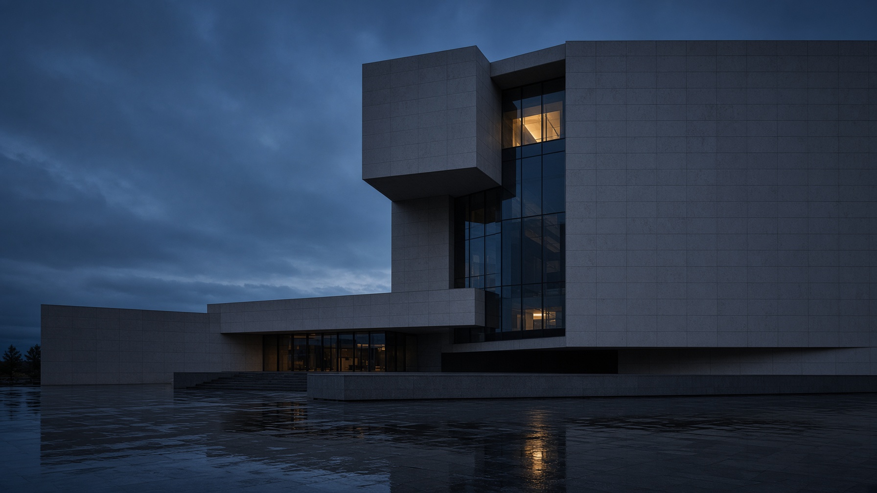
Imagery should feel collected, not produced. Architecture, paper, stone, cloth. One light. Plenty of air.
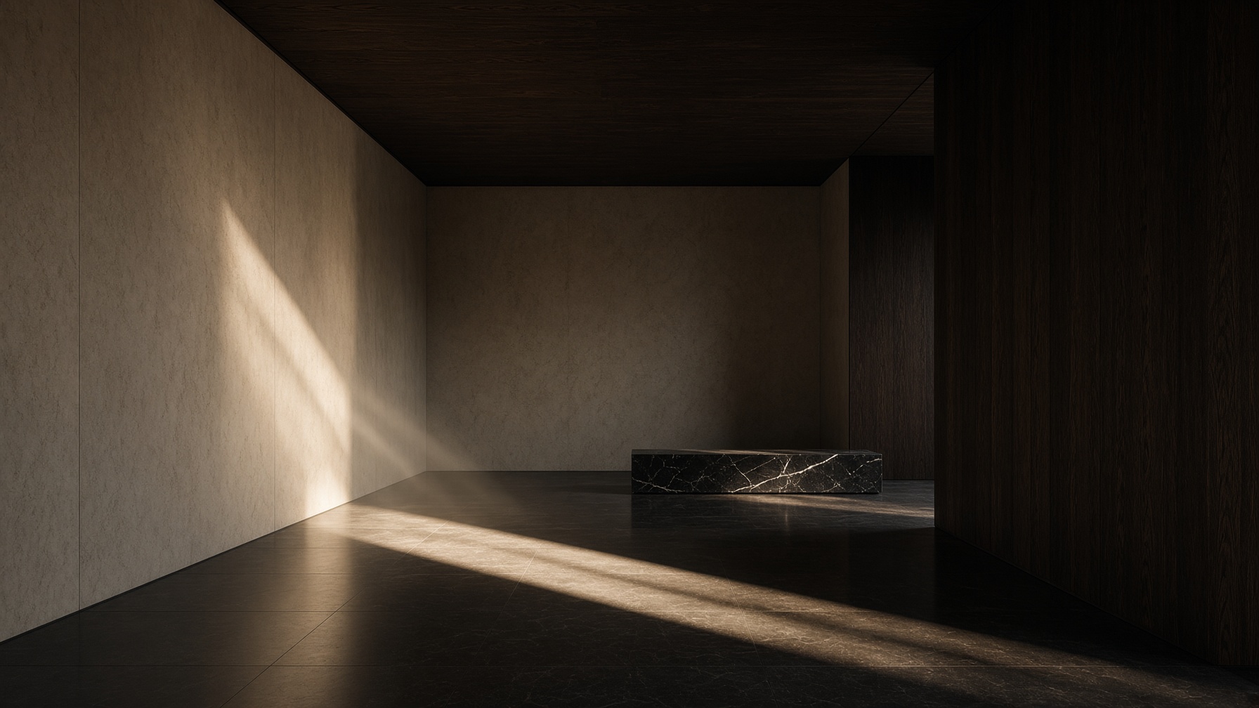


Light is a material
Prefer one directional source. Let shadow do half the composition. Avoid even, commercial fill.
Rooms, not sets
Architecture, paper, stone, cloth. Spaces that exist. No stock handshakes, no confetti, no laptops on beaches.
People, at a distance
When figures appear, they are occupied — never posing for the brand. Faces are not the product.
Quiet colour
Photograph toward Ink, Vellum, and Limestone. Remove stray primaries in grade. No teal-and-orange.
08 — Applications
Stationery, screens, and spaces. Every surface should feel like the same house — not a campaign wearing a logo.
Studio
By appointment
Kigali
studio@core.marketing
core.marketing
Core Marketing
By appointment · Kigali
studio@core.marketing
Confidential
core.marketing
By appointment · Kigali
Amara Nkusi
Partner, Strategy
studio@core.marketing
core.marketing
Kigali · By appointment
Social
01 / Presence
The architecture of attention.
Strategy, presence, content, and promotion — held as one system.
Core Marketing
The house
Fewer partners.
Further work.
LinkedIn cover. Lockup, left. Photography, held back.
Confidential
A conversation
Core Marketing · Volume 01
Presentation title. 16:9. Confidential by default.
The architecture of attention.

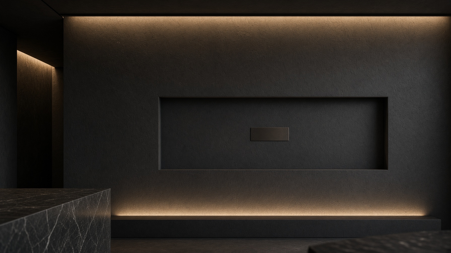
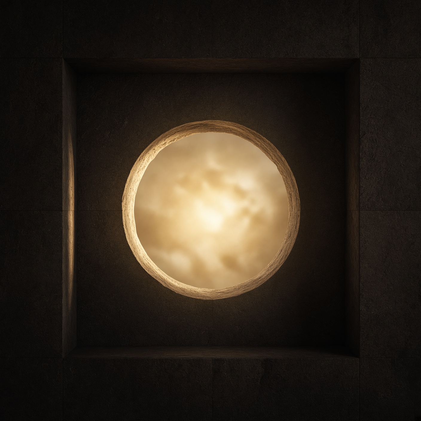
Environmental — niche, waiting
09 — System
Spacing, files, and the closing note. This is the kit — not a mood, a specification.
Grid
Twelve columns on desktop. Four on mobile. Margins generous.
Align to the spine. Do not invent a second grid for campaigns.
Space
4, 8, 12, 16, 24, 32, 48, 64. Air is a brand colour.
If a layout feels busy, remove an element before you add a rule.
Motion
150–250ms. Ease out. Opacity and transform only.
No bounce, no parallax theatre, no animation that delays the work.
Downloads
The book as a 16-page A4 PDF — send this to stakeholders. The mark alone. The lockup with words. Editable business cards (open the SVG, change the name). Letterhead and envelope. Or take the full kit.
The book
Logo only
Logo with words
Business cards
Stationery
The architecture of attention.
studio@core.marketing
core.marketing
Kigali · By appointment
Est. 2018 · Volume 01